This document compares the steps for creating a dashboard using the following two BI tools:
- IBM Cognos Analytics
- Microsoft Power BI
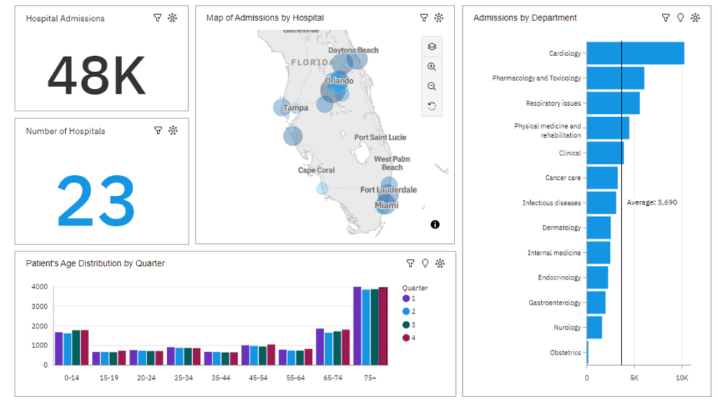
Below is the Healthcare sample dashboard which we will produce in IBM Cognos as well as in MS Power BI:

Data Source: We will import the raw data in CSV format into both tools and create a dataset/data module on top of it, which can then be used as a data source for generating a dashboard.
| IBM Cognos Analytics | MS Power BI |
| Import Data Source | |
| Once we are in IBM Cognos Analytics, Home screen appears as shown below: Select ‘Upload and create’ option in home page OR Click on Menu icon in top left and select ‘Upload Data’ Once the file is uploaded successfully. It will show the file in ‘My Content’. | Once we are in Power BI tool, Home screen appears as shown below: Click on CSV (preview) followed by ‘Upload file’ in the next popup window. Once file is uploaded, use your credentials to establish a connection and click ‘Next’ |
| Open Dashboard/Report & Select Data Source | |
Cognos directly shows ‘Create Dashboard’ option once the data file is ready for use. We can also choose the ‘Dashboard’ option from Menu > New > Dashboard OR We can use ellipsis button on recently uploaded csv file to create dashboard directly Note: We may also create data module on top of csv file and use it to create a dashboard Once dashboard is opened, select ‘Blank’ layout and click on ‘Create’ Now select the source as shown below | Power BI directly open the Report building page once the file is uploaded and converted into data model Or likewise in Cognos, we can also select ‘Blank Report’ from Home option Once the blank report is opened, go to ’Get Data’ under Home and select Power BI semantic models Select the recently created ‘Health Care Data’ model and click on Connect Note: Once file is uploaded, Power Bi directly converts it into semantic model (dataset) |
| Set the Canvas background color | |
| Open ‘Properties’ pane and expand the ‘Color and Theme’ section to set background color to gray | Go to Visualizations section and set the canvas background to gray color from ’Format page’ tab |
| Start building the Dashboard | |
| Add Summary widget to canvas Add Admissions to Base Value and set title for widget Note: We can directly click on default title in widget to update it | Add Card widget to canvas Add ‘Count’ to Field block. Note: We will show sum of count in this case. We can change the summarization using the down arrow next to count field Now go to ’General’ tab, enable ’Title’ and set the title name. |
Add second summary widget to canvas and set it below the first widget. Add ‘Facility Name’ in Field block and set summarization to distinct count | Add second widget to canvas by single clicking on open space in canvas followed by another ’Card’ widget. Add ‘Facility Name’ in Field block and set summarization to distinct count |
Now add Map widget in canvas and set it next to first widget | Now add Filled Map or Map widget in canvas and set it next to first widget |
Add Bar chart to canvas and place it next to Map | Add Clustered bar chart to canvas and place it next to Map |
Add clustered column chart to canvas and drag Age range to Bars field and Admissions to Lengths field. Set Quarter to Color field. | Add clustered column chart to canvas and drag Age range to X axis and Admissions to Y axis. Set Quarter to Legend field. |
Cognos dashboard is now ready and shows all the added widgets | Power BI dashboard (report) is now ready and shows all the added widgets |


