The 12.1.1 release introduces a Responsive Layout feature for dashboards.
This feature improves both the authoring experience and dashboard usability across different devices by automatically optimizing layouts for various screen sizes, including mobile devices. It can also be used to group content and better organize visualizations.

To use a responsive layout:
- Create a new dashboard
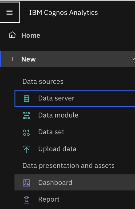
- Open the Responsive tab
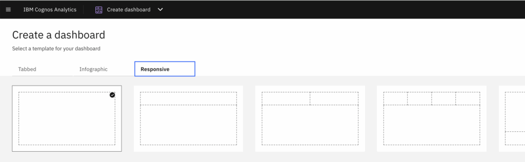
- Select one of the available templates, as shown in the image below
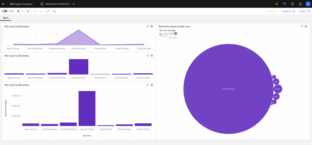
- And click on create and select data source
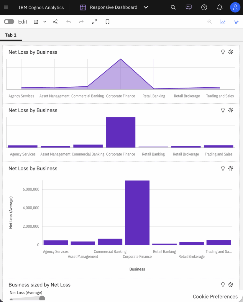
- Now add the widgets and resize the dashboard
- Widgets automatically adjust placement and alignment when panels move or the window is resized
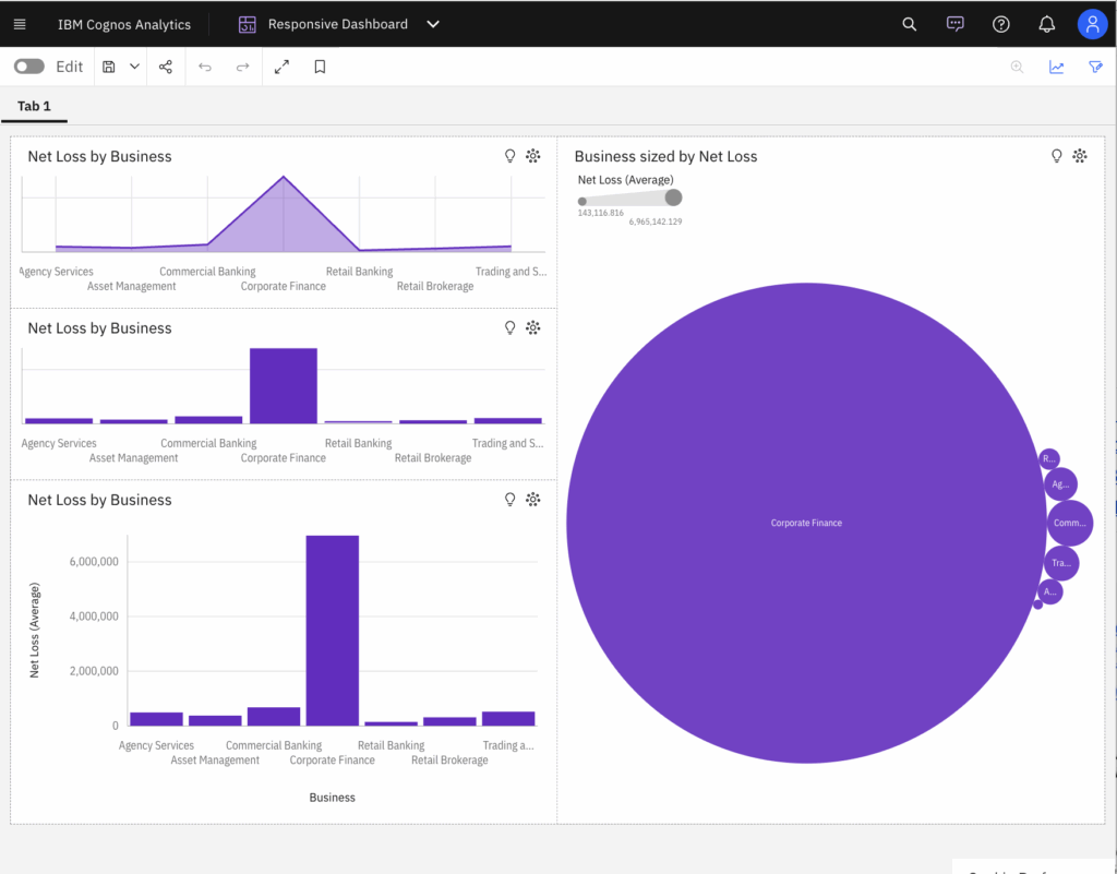
- If we reduce the size of window further, widgets automatically adjust vertically
This way, smart alignment enables smooth resizing, swapping, and layout transitions and let the layouts adapt to screen size, including single- or two-column views on smaller devices.


